Today Apple released the latest revision of its operating system: OS X 10.7 “Lion”. As it is well known and understood Apple write their operating system to sell their Mac products more than the other way around. In Apples accounting world, when you purchase a Mac it includes the cost of the operating system and this primarily pays the wages of those hardworking operating system developers. This provides Apple with a different motivation to develop its software more incrementally than a company like Microsoft, and usually what updates they make cost much less as a result. Apple in a very real sense is only trying to bring more new users to the OS X platform with each release. Apple add what they consider to be the best features to attract the maximum amount of people. Existing users can upgrade for a nominal amount (from Snow Leopard v10.6.8 only) of $29 USD (about $32 AUD takes into account 10% GST). For new Mac purchasers of course, there is no cost as it will come as standard.
When I’m judging a new operating system from Apple I look at two angles: what’s in it for existing users and what could attract new users on their key features. Before delving into the detail, Apple have clearly decided that their mobile operating system iOS, which is more finely tuned to a touch input from the human finger, has some features which can be transferred across to their desktop operating system. For the most part I agree, but only for those features that aren’t about touch interaction and more to do with the inner workings of the operating system. In addition, Apple says there are 250 new features - naturally I’m not commenting on every one, but just on those features I think are worth mentioning. If I miss a feature you think is worth mentioning that I haven’t mentioned, please don’t get uptight about it - life’s too short for that sort of thing. So now, without further ado…
Full Screen Mode: is probably the only mobile device hang over from iOS that makes some degree of sense for OS X. That said, the implementation feels a bit odd sometimes. The concept is simple enough: take any application and create a new “windowless” layout where everything in the application takes up the entire screen. This is built into the operating system and requires minimal effort from developers to add to their applications. Naturally this doesn’t make sense for an application that has hardly any controls on it or takes up a quarter of a 1024x768 screen normally without any problems. This is where the issue lies with this feature: with current desktop Mac we have 20", 24", and even 27" screens. There was a time 15 years ago when the standard screen size was a 13" CRT and at that point it made sense. Perhaps then this mode is far more useful and targeted at mobile users of MacBooks, MacBook Pros and MacBook Airs rather than their desktop counterparts.
There is also no doubt that some applications will perform better in this mode and Apple have added a standard look for all applications to enter and leave full screen mode however this is neither a big selling feature to new users or for existing users who are used to layering their windows and organising them. It seems like people will experiment and then most likely go back to the old way of doing things with layering windows. One part of the experience I found jarring was when task switching between a full screen application and a windowed one: the animation looked fancy with a fade in and fade out of the desktop and stretching of the window but when switching apps from a full-screened one to a windowed one it looked inconsistent. Consider the window switching on the iPad for example: all the apps are the same size so switching between them looks natural and consistent. On Snow Leopard, switching applications shows the windows layered and the desired window comes to the top of the stack. Switching in Lion just feels wrong as two different paradigms are trying to co-exist. It’s probably a bit nit-picky, but to me this seems like an occasionally useful feature that only mobile user will use for a small handful of applications.
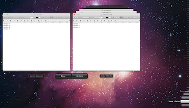
Auto-Save and Versions: are technically two different features but since they are closely linked together it makes sense to consider them together. As a long time computer user who has been inflicting with many hours (days even) of rework as a direct result of not saving often enough coupled with a PC/Application crash/freeze, I can tell you that this feature is my personal favorite. I expect many other people who rely on PCs for a living by creating content (particularly written) will agree with me on that.
How it works is so ridiculously simple: any document the user is working in is automatically saved as they type/modify it. For this to work it must be supported by the application - I’m told it’s not too hard to add to existing applications if they have been created using standard operating system functionality from previous versions of OS X. The natural reflex action my left thumb and 4th finger have developed to hit Command-S to Save (at any time I can take a breath from typing my document) will not be completely defunct as Apple still allow manual saving of a version of the document this way at any time. Manually saved and auto-saved content is then available as different versions of the document. Rather than explain what it looks like, when browsing through old versions of your doccument it looks exactly like Time Machine - but only for the file you’re working on.
This makes it easy to flip back and look at the older versions as well as copy the information you may want between the old and new versions. The number of times people will lose the work they have poured hours and days into will diminish significantly with this feature - provided the application supports it. This should please existing and new users alike as this solves a problem on all other operating system platforms and currently only OS X has this feature.
Resume: seems innocuous at first blush but like Command-S (or Ctrl-S for Windows users) it’s something that has become second nature for existing users. When shutting down you simply need to shut down all the applications that are open and when you restart your computer you then need to reopen the applications you want, right? Not any more with Lion. It’s such a simple thing: just shutdown and start-up or just restart your Mac and leave everything open: it just comes back where you left off - even down to the place you were in the document you were working on, the page of calendar you were looking at and so on. This feel like Multi-tasking that supports a PC off state: something that iOS doesn’t even support (yet). It’s a great idea and removes an old bug-bear of mine, but to new and existing users it’s unlikely to be a big ticket item that encourages them to upgrade/switch.
Launchpad: is Apples acknowledgement that many users placed an Applications folder on the Dock and used it as a stack as a grid or list to find their applications. Well, at least I did and I’m sure lots of other users did too. Existing users have their own methods of choice: some use keyboard shortcuts, spotlight and even just the dock, but Launchpad is more analagous to an iOS home screen of apps. It shows folders and allows swiping (or the keyboard arrow keys) between pages of applications for navigation when there are a large large number of applications installed. For me personally, it’s moved the Applications stack folder to a new spot on the left hand side of the sidewalk line on the dock and given it a pretty silver rocket icon. For existing users there will likely be a collective sigh followed by a distinct ho-hum. For new users however it’s a built-in way to find your applications that is better than most other ways and takes very little to learn and understand.
Mission Control: for existing users is just Expose done differently. For new users it’s like Windows Aero with better organization. In and of itself it’s not that big a deal, but it does solve the problem of spaces being under-utilized but how many regular users find spaces compelling enough to use? One complaint I do have with Mission Control is that whilst it groups together windows from a common application (in Snow Leopard all windows were made the same size and not grouped by application) Mission Control layers those windows and for more than two windows it’s very difficult to see what the window is underneath. It is possible to click and drag the windows out from under a stack of windows but then a traditional Snow Leopard Expose wouldn’t require such a step. Mission Control (like full-screen applications) seems to be more useful for smaller screen mobile users as it is more space-efficient than Expose for a large number of windows. For existing users, I expect either a yawn or perhaps a brief irritation for this feature and for new users I expect them to be impressed - albeit breifly.
Gestures: are different depending upon whether you have a magic mouse or a magic trackpad but let’s be clear: without either device there’s a fair amount of useful shortcuts that Lion brings that will not be available to you. The argument between Mouse vs Trackpad will doubtless continue, however there is no doubt that the gestures are faster than keyboard shortcuts and moving the mouse and clicking in most cases. However the gestures chosen differ from those found in Snow Leopard in some cases that will irritate existing users who have already learned them.
The biggest oddity for me is the move on the Magic Mouse toward so-called “natural” scrolling. In this way pulling a single finger towards you on the mouse moves the screen contents down in the same direction as your finger. This makes more sense if you hold the mouse up on the screen and try it. Apple calls this natural because the content follows the direction of your finger. What’s a problem is that years of scroll wheel mice on PCs have trained existing users that pulling the finger towards you scrolls down the page and I have to say, it’s very, very disconcerting when it’s upside down. Thankfully Apple provide an option to turn this off in the system preferences. Doubtless many people will be turning it off. New users - new to PC/Macs will not mind as they know no differently.
If you have a Magic Mouse you may: Double-tap one finger to Smart Zoom, Swipe one finger Left or Right to switch between pages in an application, Swipe two fingers Left or Right to switch between applications, and double-tap to bring up Mission Control.
If you have a Magic Trackpad you may in addition: Pinch-To-Zoom, Access App-Expose, LaunchPad and Show the Desktop with configurable gestures.
In short, existing users will still have software like Better Touch Tool that will give them full control of their Magic Mouse or Magic Trackpad by overriding the built-in gestures. New users should seriously consider the Magic Trackpad over the Magic Mouse for access to all the gestures available in Lion, but as a long time Mouse user I find trackpads to be slightly more cumbersome - there’s no doubt it’s also personal taste. As I’ve written previously, touch input is the way to go and existing users should get either the Magic Mouse or Trackpad if they have neither for their desktop Mac.

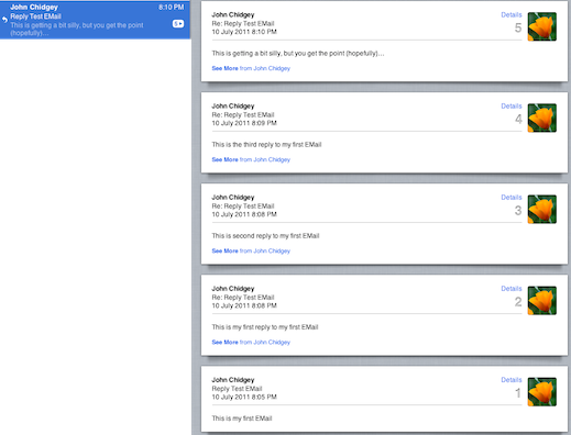
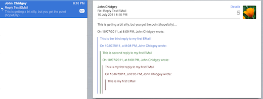
Mail: During the WWDC keynote my initial impression of Mail was somewhat of a ho-hum, however a recent study showed that filing email is a pointless exercise because it’s faster to search your emails than to try and filter through them manually by folders/sub-folder. This makes the new search functionality in Mail extremely useful. When you enter the search term, if there are multiple emails found with that search term, Mail indicates in a drop down list under the search box where it found the search text by group: To, CC, Subject etc. When you select the one you want it completes the search term for you aand you can then add the next search term. It is by far the easiest email search tool I have ever used. People that use Mail as their email client and (like me) have lots of email to search through will adore this feature. The conversation view (second image adjacent) much touted in the keynote that shows an alternative view of emails as a list of emails of the same subject as a group of individual emails in a long scrolling window. The concept is great as it avoids the indentation problem that gets annoying after the fourth response (third image adjacent). In practice I found this feature to be unreliable, with a simple two response email missing parts in conversation view. It also broke down and incorrectly identified emails from an automated system with a common subject as a conversation (a mistake that iOS Mail doesn’t make - refer first image adjacent). Existing users will be happy with the additional features offered here, and new users will also startseeing Mail as a more viable email client. The reality however is that Outlook will still be the defacto office mail client standard.
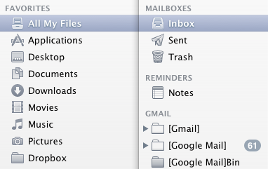
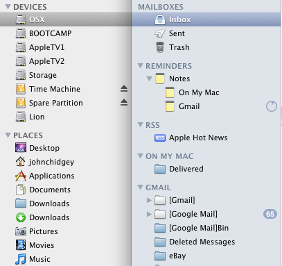
Grey, Grey and Lots more Grey: it’s just everywhere. The preferred icons are now silver and shiny and the colour coding from left hand pane in the Finder and iTunes (and several other places as well) has been replaced by a greyscale icon/text arrangement for selections. (Images to the left: first is Lion, second is Snow Leopard for both the Finder and Mail respectively) There seems to have been quite a bit of controversy and debate about this, however having done a great deal of user interface design, the “greyscale” motif that Lion expouses is becoming more common. The concept is that colour is distracting, and only those items that have meaningful status or indication should appear in colour. The brain tends to tune out grey and allows the user to focus on what’s important. Of course this concept can be taken too far and some have argued that the interface looks bland. I don’t agree with that sentiment but then I can understand how some people will find it annoying. Existing users in particular could be annoyed by this, but new users will likely think nothing of it.
iCal: was given a bit of air brushing and now sports an updated day view which is effectively identical to Calendar on an iPad under iOS and a year view that shows days shadeded in darker colours based on how many appointments you have. The functionality of iCal is largely unchanged. Nothing much to see here; move along.
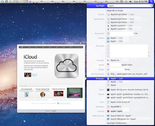
Spotlight: has been one of the best features of OS X since its introduction in Tiger and hands-down beats any other searching tool for a PC. How Apple have pushed it forward in Lion is to add previews from within the search results drop down list. The first time I saw this I was stunned as my search term found one of my Safari bookmarks, and by hovering over that bookmark, a small window popped out the left and started loading the page in it. I’m really not sure how much people will use this feature but having quick look functionality in Spotlight is great idea and will make it quicker to find exactly what you’re looking for without having to jump between Spotlight and the Finder and back again. New and existing users will likely be very impressed by this feature.
Address Book: has had some additions - finally! It’s not so much that photos for contacts can now be linked to Facebook (you still need an iOS device to do this at time of writing), iPhoto and “better” to Yahoo and that birthdays needn’t include a year anymore (for those sensitive about their age I guess) but it’s more that it’s getting some work done on it. Address Book has been a very stagnant application from Apple for quite some time now and these are nice additions. Nothing ground breaking, by welcome never the less. Exising and new users should be happy with these additions.
Air Drop: seems like a nice idea - alas I was unable to test it myself due to only having one Mac in the house. It will certainly beat the humble flash disk between Macs, but it is useless for transfer between Macs and PCs running Windows. The most common application i would personally use it for would be for sharing files between my Mac and my wife’s PC or my Work PC - both of which are Windows PCs. Alas. Existing users that live/work in All-Mac environments will be happy with this feature, but for the rest of us it won’t get used.
Rosetta: is no more in Lion. For those that think I’m talking about some old stone tablet: I’m talking about how Tiger, Leopard and Snow Leopard supported older PowerPC applications (generally those written prior to 2007) by bundling every “Universal” Application on the system with two Applications: One that runs on Intel and one that runs on PowerPCs. Rosetta allowed applications that weren’t Universal to run on an Intel Mac. Apple provided Rosetta to bridge the gap for software developers to port across their older PowerPC apps to Intel. It has been over 5 years since the Intel transition of the Mac and Apple clearly feel it’s time to get rid of the baggage. Lion will therefore no longer support older PowerPC Applications. This is a plus in one way - as there are no more Universal Applications, the file sizes will be smaller for each Application. Existing users with their favourite software from pre-2007 will be very disappointed.
In summary, Lion is worth every cent of the $30-odd dollar upgrade price. Existing users should definitely upgrade and new users will not be disappointed with their purchase. Lion is far more an OS upgrade than Snow Leopard was and yet it costs the same as the Snow Leopard upgrade did. It feels like Apple has been working on these under the hood features since before Snow Leopard and its high level of integration and polish show that. Certainly there will be some users that don’t want to upgrade - namely those locked into using Rosetta applications, however this is likely the minority. An excellent step forward for the Mac operating system.